

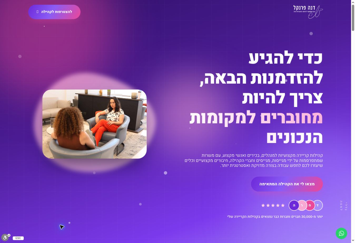
Dana Frenkel is a strategic career advisor for managers, executives and professionals. The landing page presents her career communities and explains how to join the right one.
The aim was to move from understanding the communities’ value to submitting an enquiry, with a clear explanation of suitability by field, joining stages and Dana’s role as the community leader.

A page structure leading to registration
Design and messages for a professional audience
Community suitability form
The page uses purple and pink tones, Dana’s photographs and messages highlighting professional connections and opportunities.
The content explains what visitors can expect in the communities and how joining works.
The form collects contact details and professional fields, alongside consent in accordance with the privacy policy.
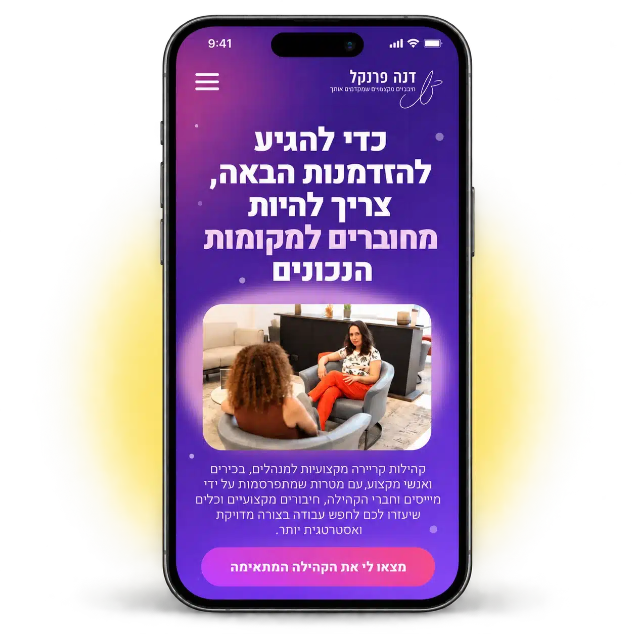
A landing page may open from a message, social media or a link sent to a phone. The offer should therefore be clear from the start, with easy access to the form and an explanation of what happens after registration.
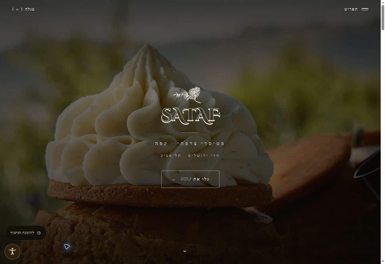
SATAF is a French patisserie with locations in the Jerusalem Hills and Tel Aviv. The website connects the experience on site, the work in the kitchen and the creations in the display case with a TO GO store for ordering and collection.
The goal was to retain the character of the place online and make the journey from discovering the brand to choosing products and collecting an order clear.
Preserving the brand’s visual language
Combining content and a store
Ordering and collection process
A dark palette of natural tones and gold connects the landscape, pastries and SATAF story.
The website presents both locations and the products, with a path to the TO GO store.
Content, images and products are managed in WordPress and WooCommerce for ongoing updates.
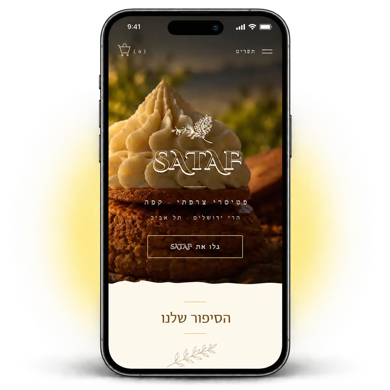
For someone looking for a patisserie or placing an order for collection, their phone is an important point of contact. The mobile experience connects images and the story with the locations, menu and TO GO store.
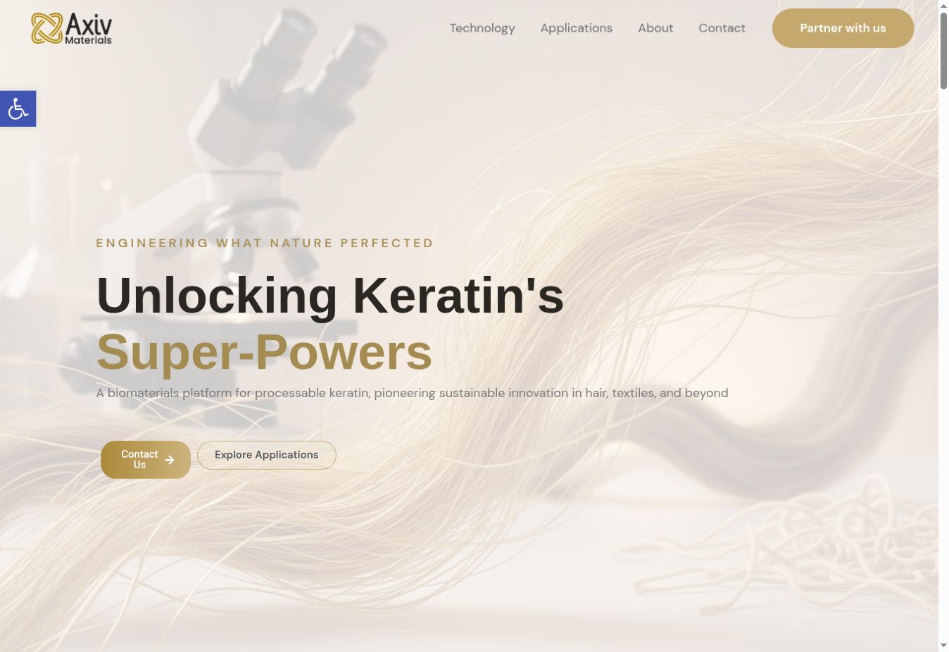
Axiv Materials develops a platform for keratin-based materials. Its English-language website presents the challenge, technology and applications in hair, textiles and industrial materials.
The challenge was to organise complex technical information into a clear story for a business audience: the problem, how the platform addresses it and the applications it serves.
Content structure for a business audience
Design for a technology brand
Presenting applications and partnerships
Light and gold tones, with imagery inspired by science and materials, create a consistent brand language.
The website leads from the problem to the platform and its applications, then to the people behind the company.
The enquiry form lets visitors provide their company and area of interest for a business conversation.
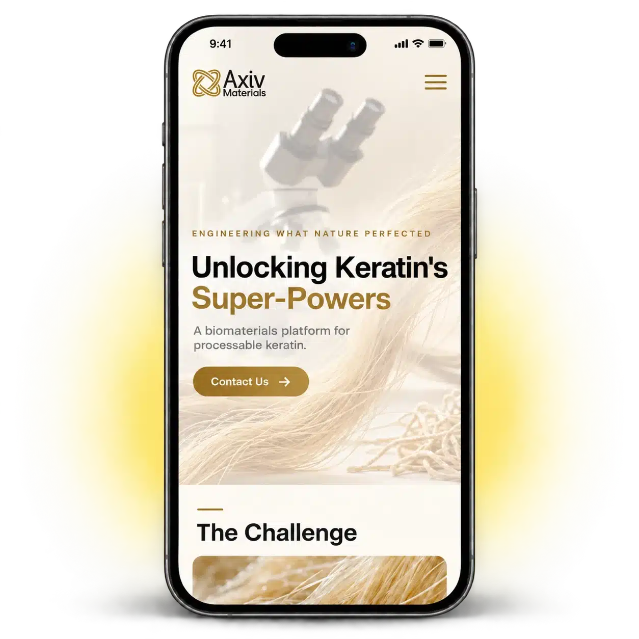
Business audiences visit on their phones too. Axiv’s technology story, applications and invitation to collaborate need to be clear on a small screen, with easy navigation between topics.
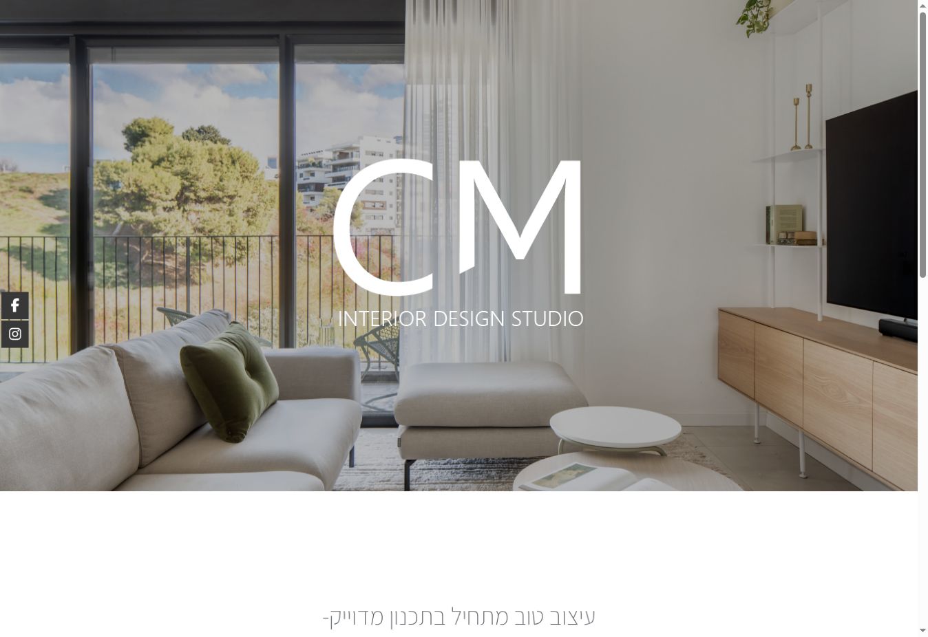
STUDIO CM is an architecture and interior design studio run by Hila Marin and Einav Chen. The website presents its planning approach and work through interior photographs and selected projects.
The aim was to give the studio’s work a stage, with restrained design that keeps the photographs at the centre and introduces the approach and projects.
Design centred on project photography
Building a content hierarchy
Presenting the studio’s identity
Interior photography is the main element, supported by clean typography and space that lets the details stand out.
Selected projects present a range of work and lead to the full portfolio.
The connection to social content lets visitors continue discovering the studio’s activity.
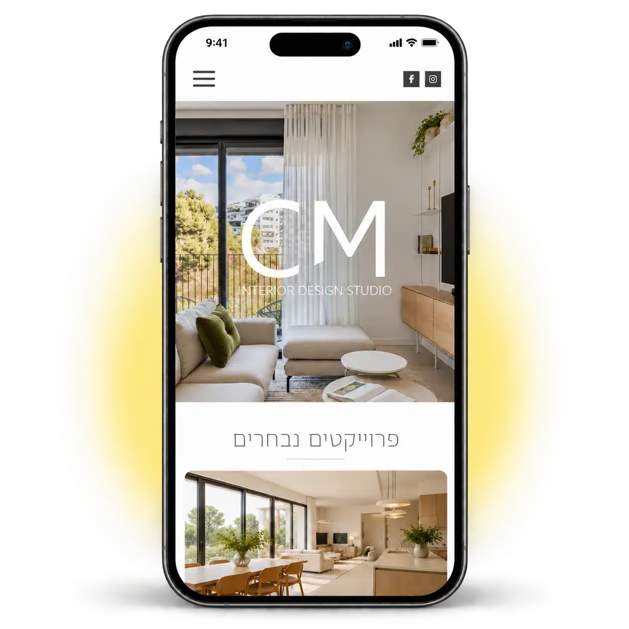
For an interior design studio’s portfolio, mobile should retain the presence of the photographs and the feel of the brand. The focus is on showing projects without clutter and making it easy to discover more work.
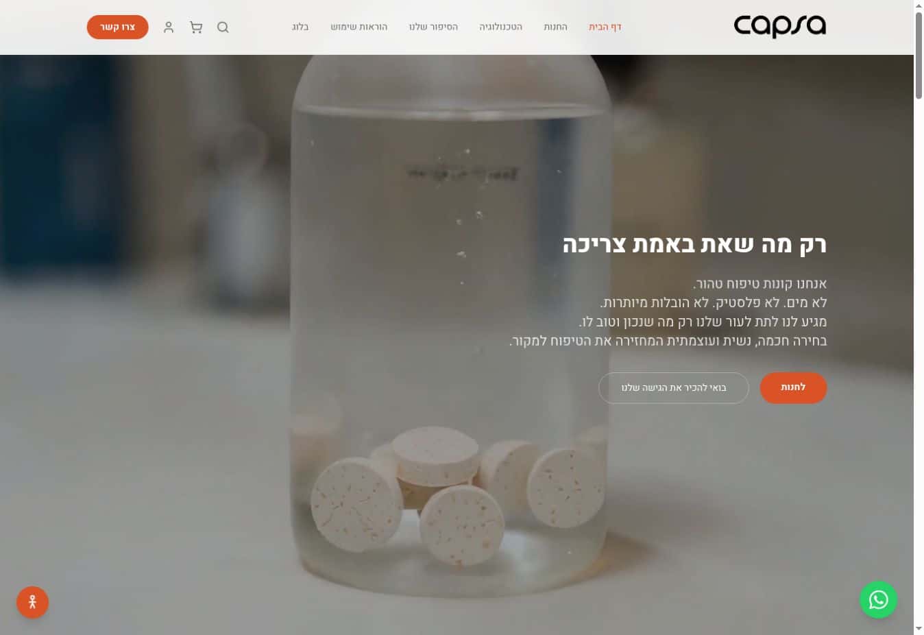
CAPSA is a skincare brand based on capsules. The website connects the brand’s story and approach with its product catalogue, explaining the technology and how to use the products.
The challenge was to explain a product with a distinctive way of being used in simple terms, and connect the introduction to the brand with a clear route to the store.
Connecting content and commerce
A visual language for the brand
Organising product information
The visual language combines clean design, product photography and orange accents.
Navigation connects explanations of the approach and technology with the products and directions for use.
The store is integrated into the brand experience and brings the catalogue together in one place.
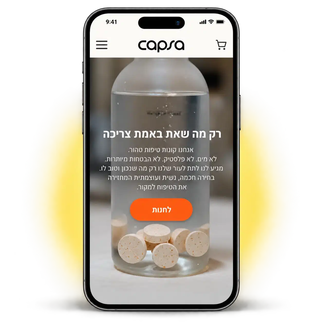
In a skincare store, visitors need to understand the product and how to use it on their phones too. The mobile experience matters especially when moving between the brand story, directions for use and the store.
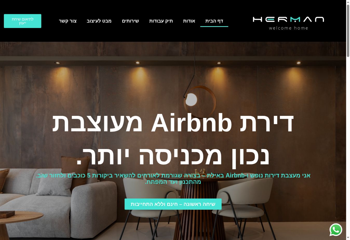
Nofar Herman is an interior designer and architectural technician in Eilat. Her website presents her specialism in holiday apartments and Airbnb properties, alongside renovation guidance, supervision, business licensing and building permits.
The goal was to connect her design work with her professional service: let the images speak while explaining how Nofar guides clients from planning to project completion.
Presenting the specialism and audience
Design and a visual portfolio
Guiding visitors towards contact
A dark palette with turquoise accents frames the interior photographs and Nofar’s identity.
The website connects projects, service descriptions and a personal introduction so clients can understand the guidance offered.
Calls to action lead to a consultation and direct contact.
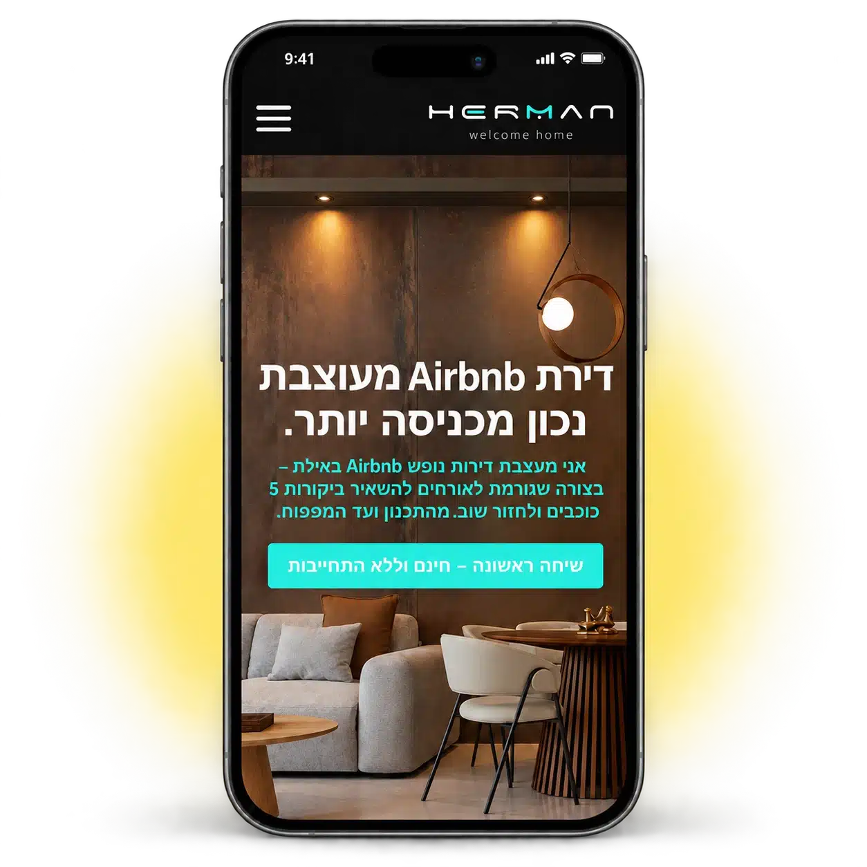
Interior photographs deserve room on mobile too. Nofar’s mobile experience focuses on discovering her projects and services, with a short path to WhatsApp and a consultation.
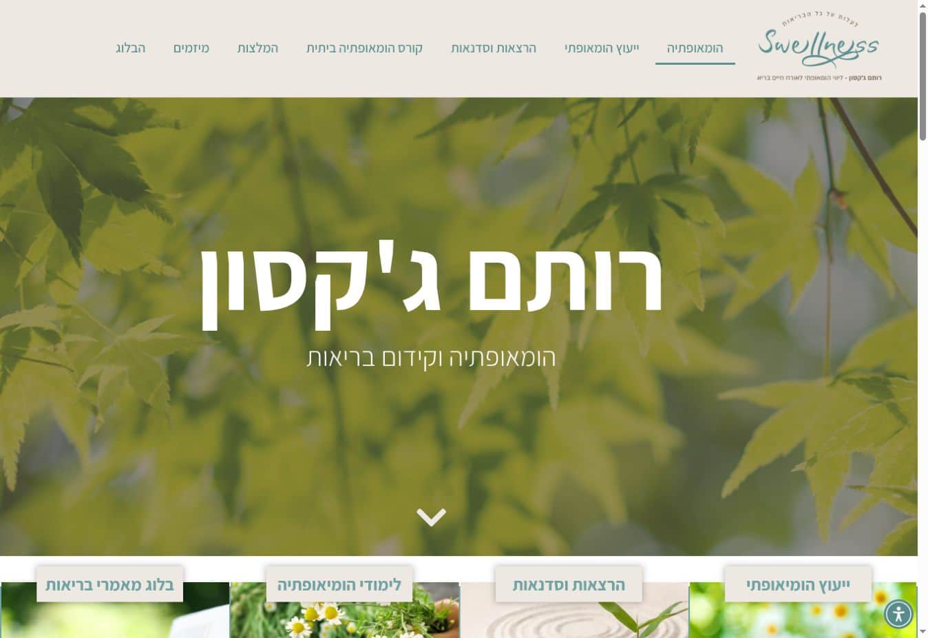
Rotem Jackson works in homeopathy and health promotion. Her website presents her areas of practice, workshops, studies and approach, helping visitors learn about her services and get in touch.
The challenge was to bring several areas of practice together in one website, with clear navigation between personal consultations, talks, courses and articles.
Content structure and navigation
A soft, natural visual language
Presenting services and contact options
The design uses natural colours and images that connect the content with the business’s visual language.
Services, content and testimonials are organised so visitors can choose what interests them and continue to the relevant page.
The website is a home for Rotem’s professional content and enquiries about consultations, workshops and studies.
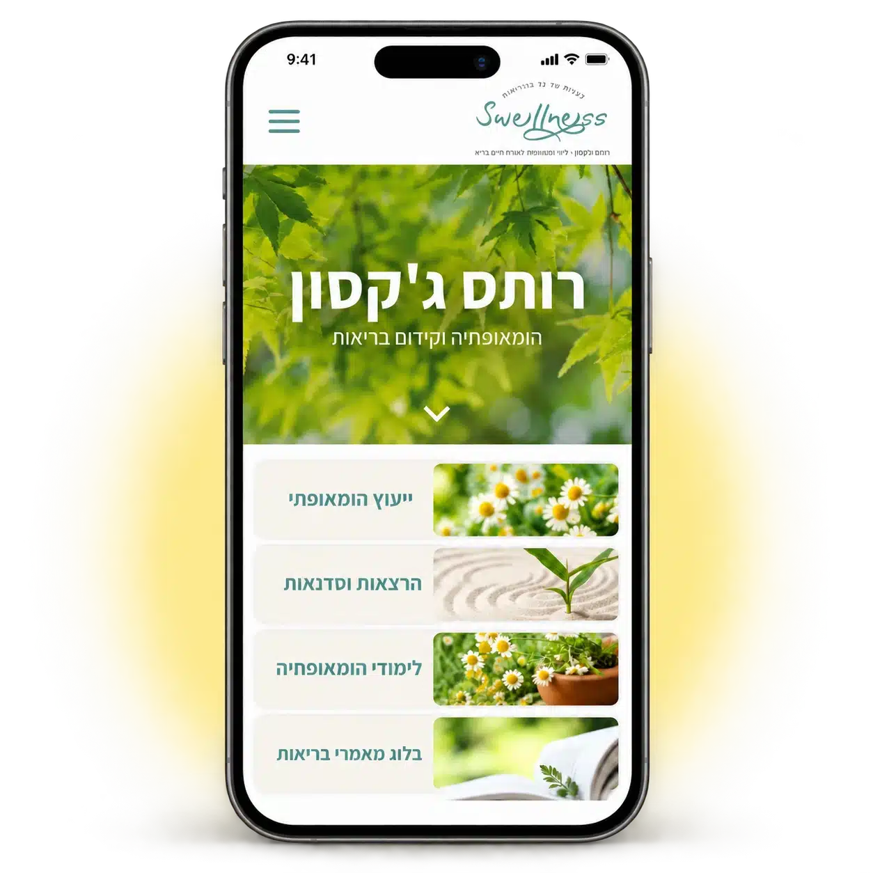
On a website bringing together consultations, workshops and professional content, mobile visitors need to understand quickly where to go next. The mobile experience connects the main message, services and contact options.
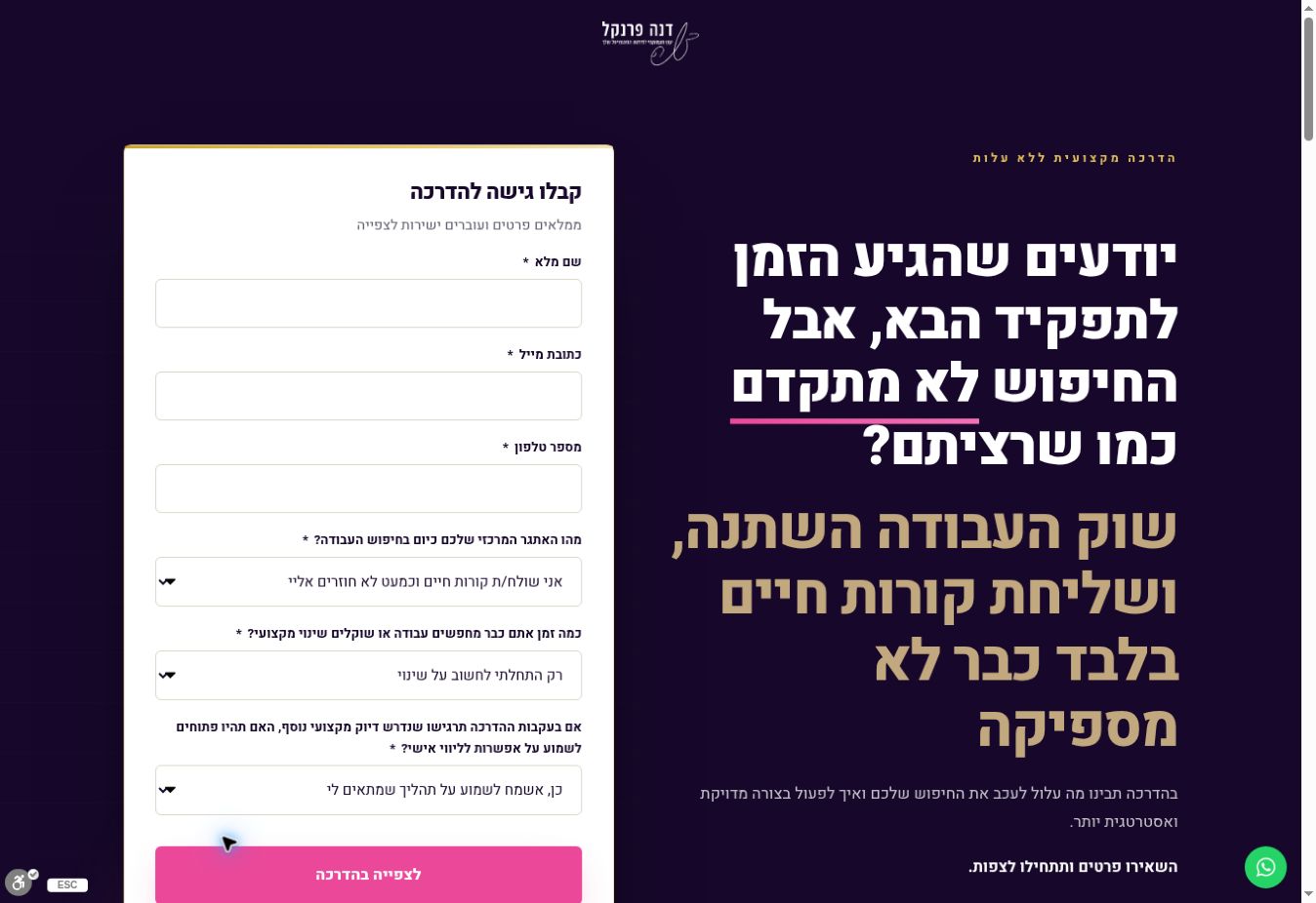
The landing page presents Dana Frenkel’s workshop on job searching in today’s market. It addresses managers, executives and professionals, leading from the challenges of job searching to workshop registration.
The aim was to explain who the workshop is for and what visitors can learn, with a clear path to submitting details and watching.
A page structured around registration
Design and messaging for the workshop
A form with focusing questions
The visual language combines dark purple, gold and pink accents to highlight the messages and registration form.
The page connects familiar job search problems with workshop topics and Dana’s professional approach.
Forms appear at two points, allowing registration after a brief introduction or after reading the full information.
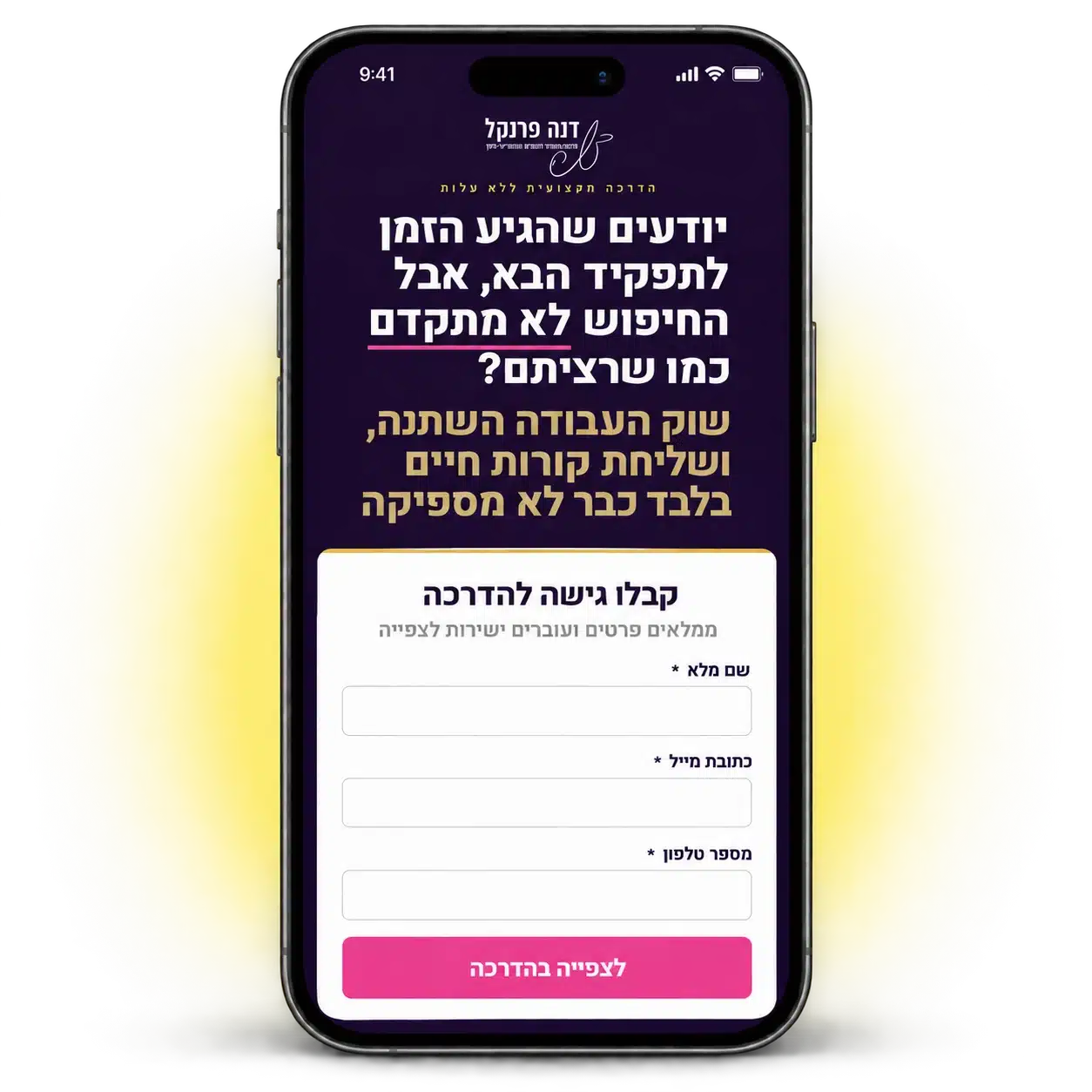
The mobile experience connects the visitor’s challenge, the content’s value and registration to watch. Short sections and a clear route to the form help visitors choose their next step.